1. Context & Problem
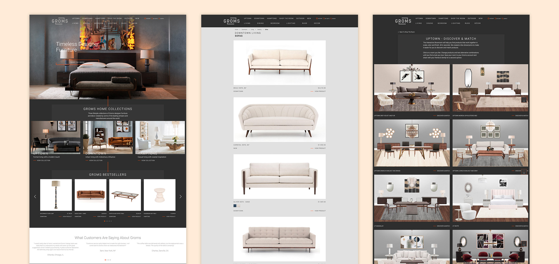
- Groms curates and markets luxury furniture to homeowners with an eye for interior design.
- Having confirmed users were having a hard time visualizing products, Groms asked us to design a tool to showcase their products in the context of the user’s home.
- The tool designed is part of a larger ecommerce website.
2. What We Did
- Brainstorming
- Co-Creation workshops with users
- Webapp design
3. Brainstorming
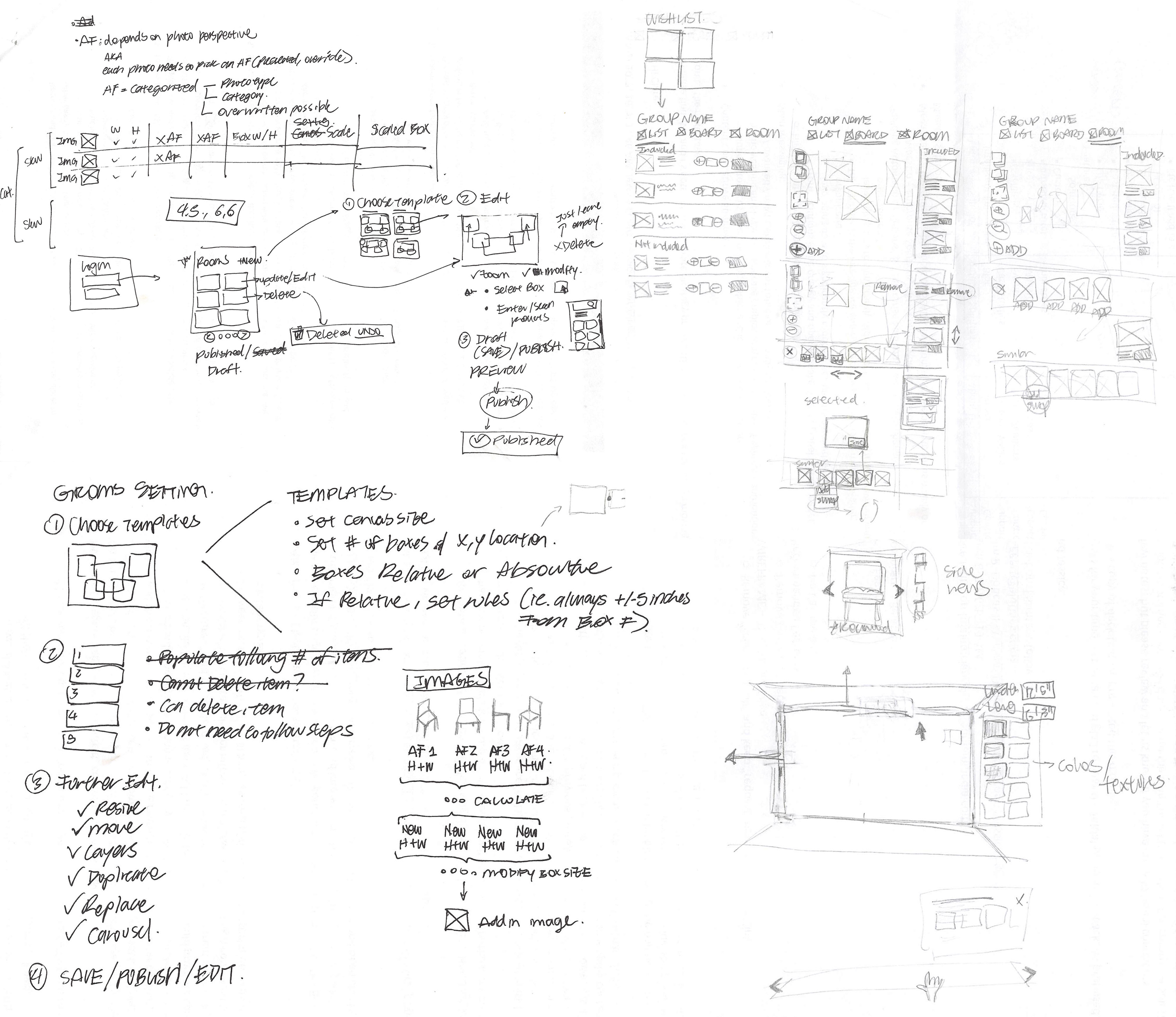
A few workshops were with interior stylists to understand the needs and co-create solution ideas.
4. Key Findings
- Users want to shop products shown in inspirational images and not have to hunt for them across listings.
- Users intuitively place swatches and items together to feel the space without knowing they are creating moodboards.
- Standard graphical software features such as rotation, mirroring, concept of layers, etc come naturally to users due to the proliferation of graphical tools such as Powerpoint and image editing apps.
- Room size affects spatial perception of the items inside. While a group of items might seem cramped in a smaller room, it felt perfect in a larger one even in a 2D space.
- Perfect representation of a room is not necessary, users can visualize the tone of the space by simply arranging palettes, furniture, and seeing an approximation of the space dimension.
5. Recommendations
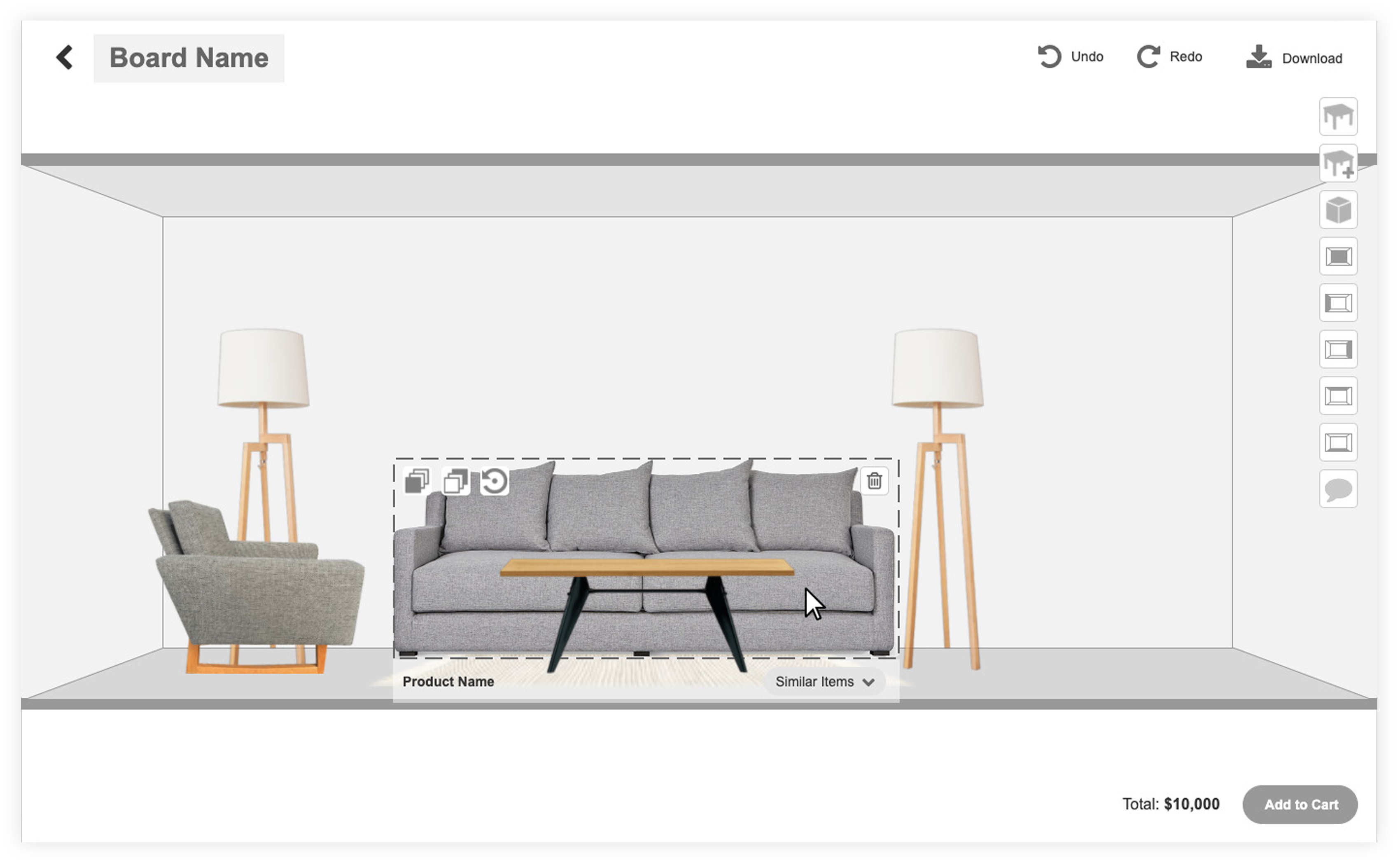
Familiar functions such as layering, rotating and dragging were included and made consistent to common visual editing tools (e.g. Powerpoint).
- Layering allows users to place items in custom positions.
- Rotation loads side views of the respective piece, as opposed to the angle rotation used in other visual tools.
- Each piece can be removed as necessary.
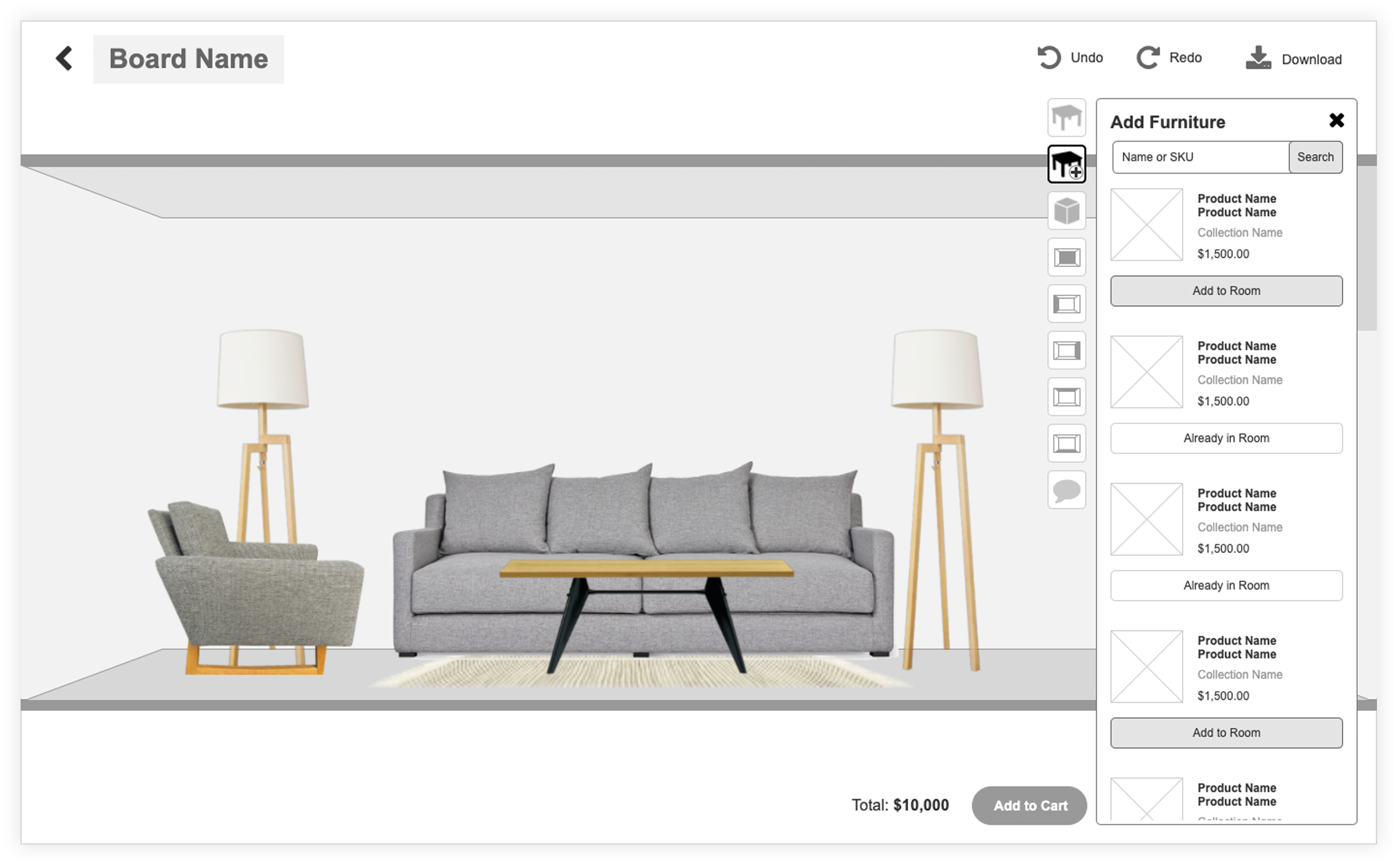
Keep track of items added to the room, but also provide ability to add new ones.
- Similar pieces are pre-curated by a stylist and linked in the back-end.
- Scrolling through pieces in-place allows users to instantly see how they match within the composition.
- Alternatively, users can bypass curation and add pieces on their own.
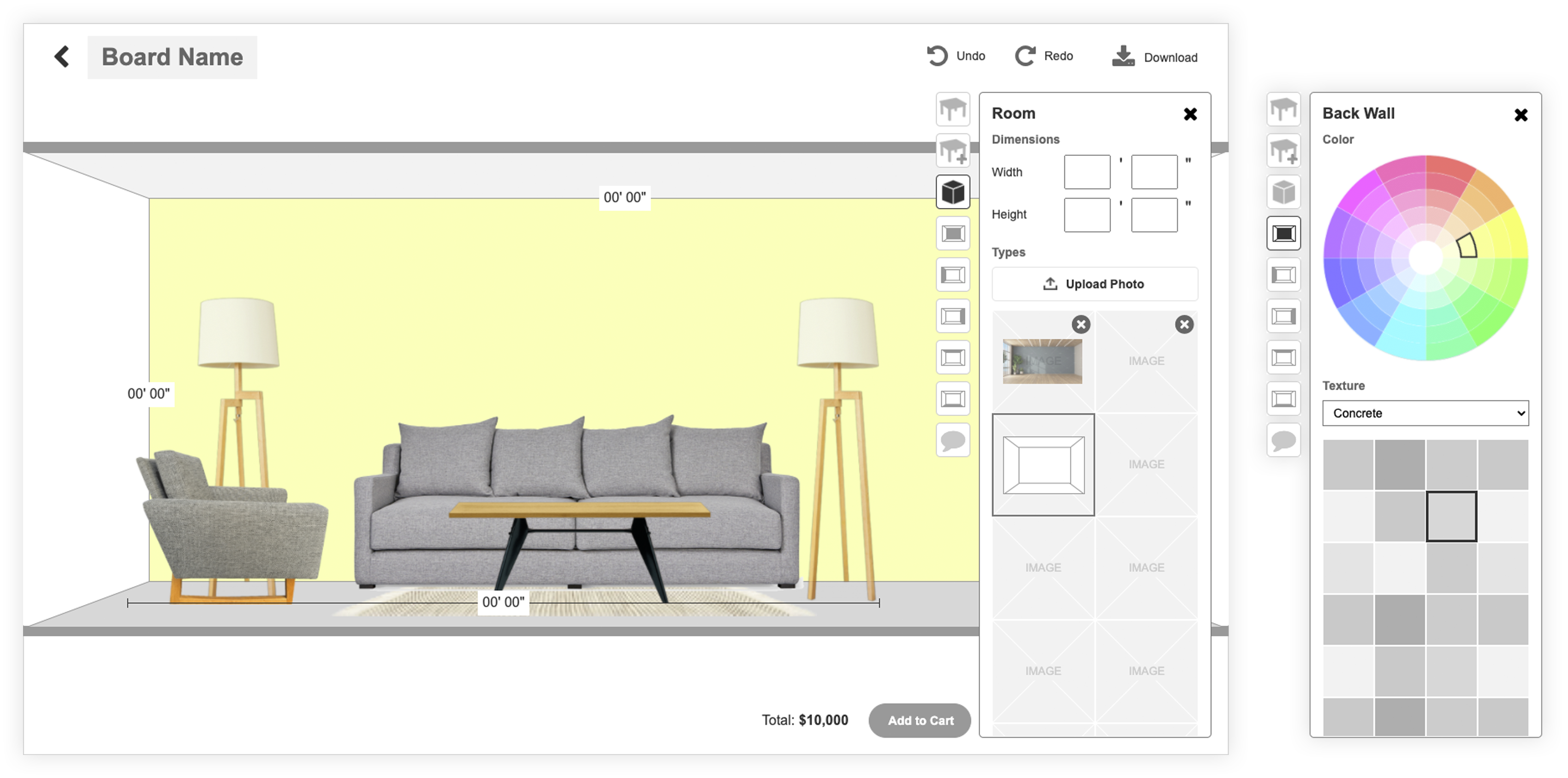
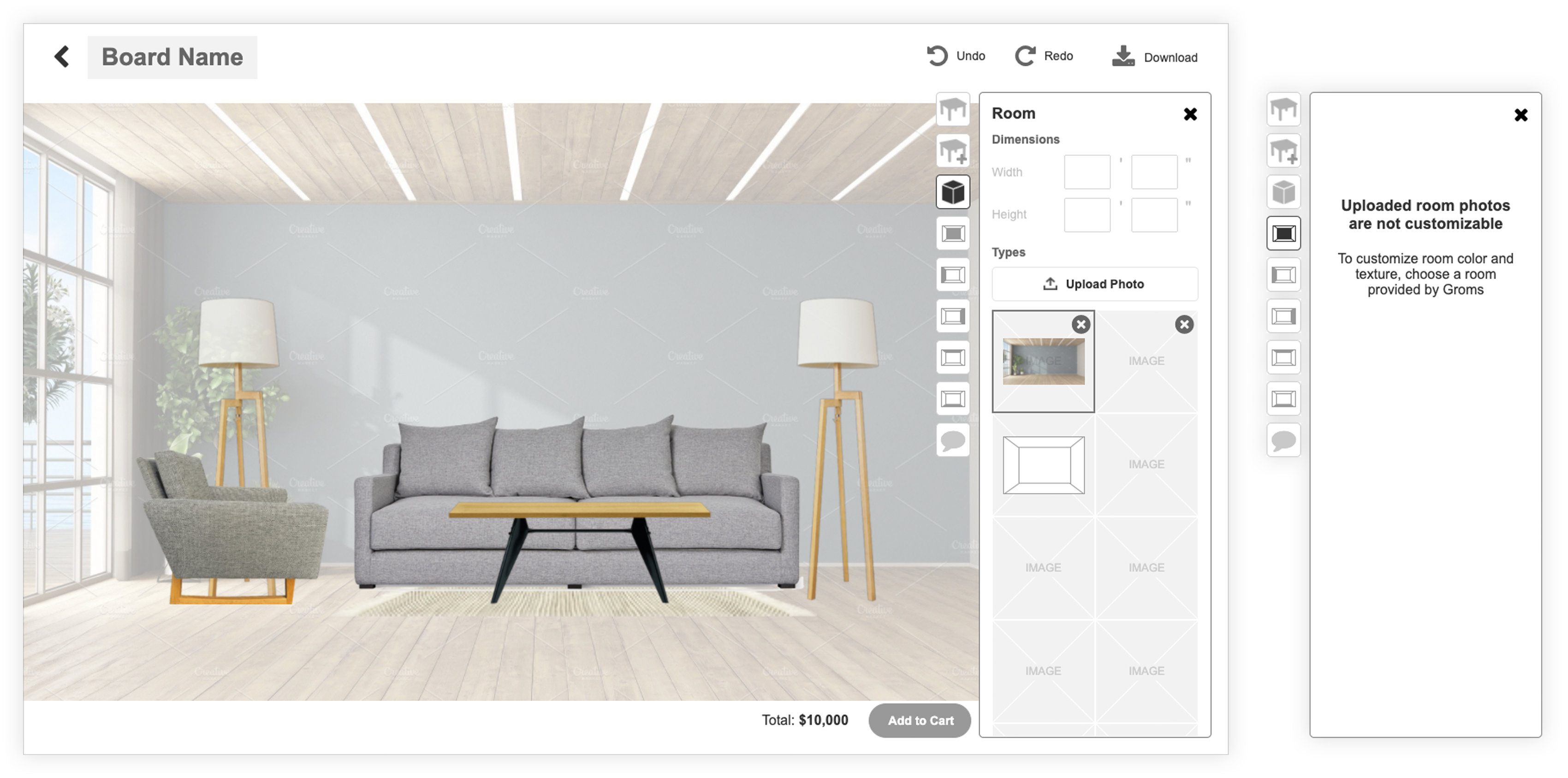
Walls, floor and ceiling can also be edited to resemble the user’s room. However, the objective of the moodboard is not a realistic representation, but an approximation to reality.
- Real dimensions can be entered, which are translated to the size of the canvas.
- Preloaded rooms backgrounds are provided.
- Users can upload photos of their room to use as backgrounds and replace the tool’s default look.
- Solid colors or preloaded textures can be applied to the ceiling, floor and walls.
6. Challenges & Learnings
Due to the limited involvement and control our team was allowed to have, most reasoning and analysis of user needs were done by the client.
The team suggested interviews or a proof of concept approach to collect data and gauge reception. Such ideas were rejected in favor of a full fledged launch. We could only settle to create a product tested for usability with coworkers.
7. Reference Material
For a deep dive into the project, please reference the following links:
