1. Context & Problem
- Deer Creek Seed is a century-old producer and distributor of seeds primarily for farmers, hunters and landscapers.
- Over the years, the company has created and consolidated multiple sub-brands under its umbrella.
- Their products are available across the entire country but most customers are unaware of who they are.
- In conjunction with updating their website, Deer Creek Seed tasked us to review and reorganize their brand.
2. What We Did
- Audited product SKUs, categories and their respective brands / sub-brands
- Interviewed stakeholders: Customers (Farmers, Landscapers, Hunters), Warehouse Workers and Wholesale Purchase Agents.
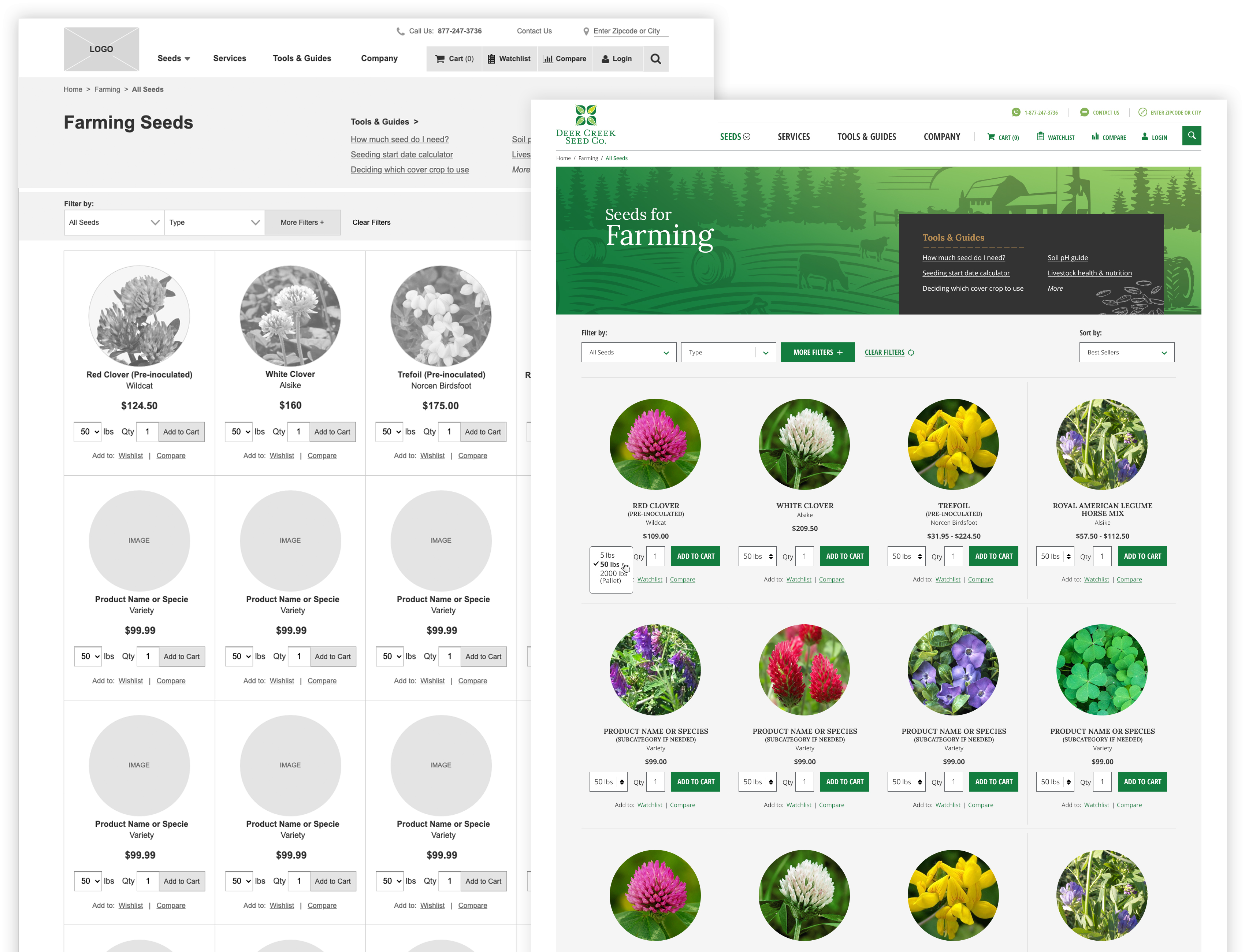
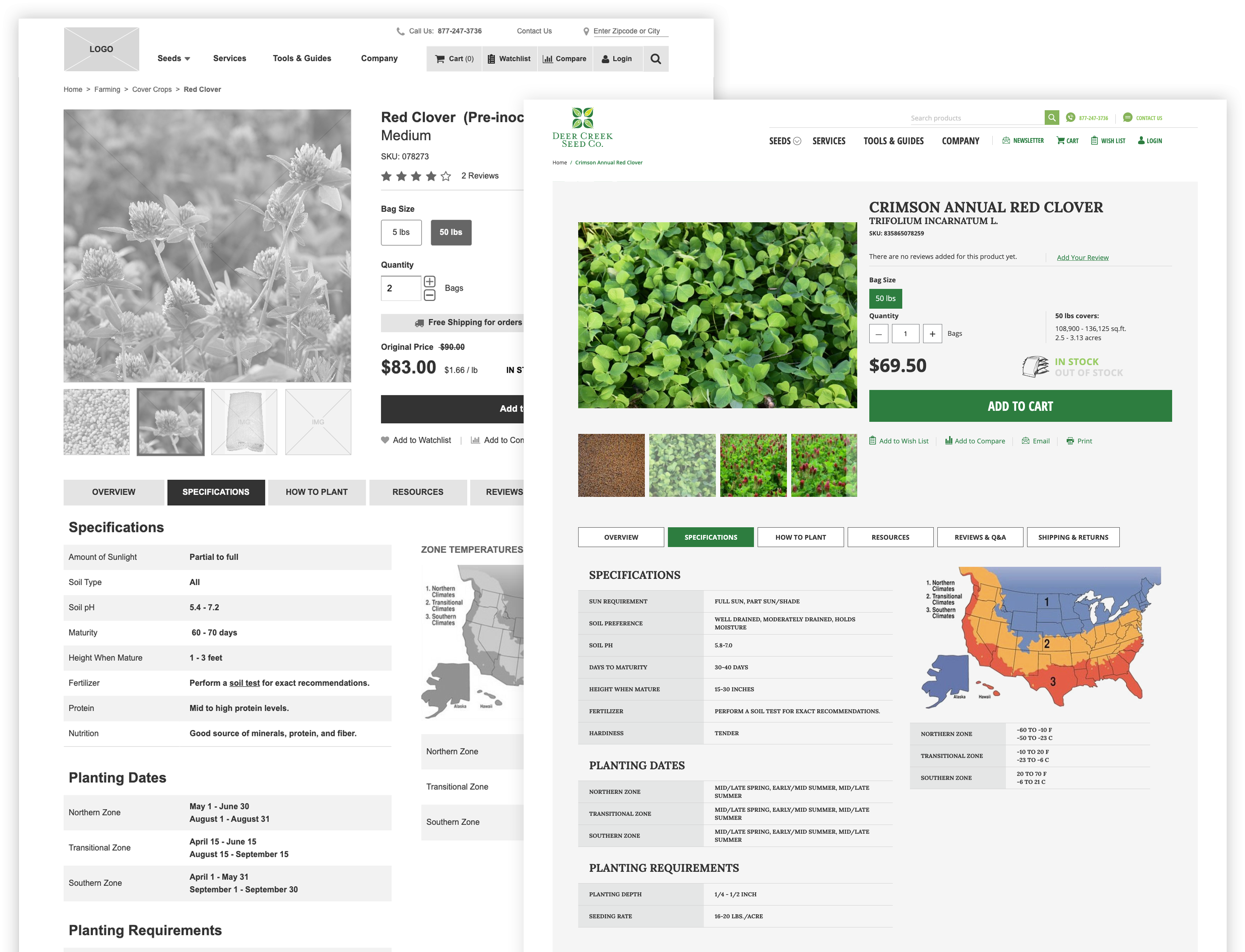
- Website redesign.
3. Key Findings
- Increasing number of both experienced and inexperienced customers are not sure what seed species to buy for their own application.
- Confusion extends in-store, where customers are unsure which seed is optimized for which application.
- Warehouse employees acted as customer service reps and are often flooded with 20-40 min long calls and emails regarding what seeds to buy.
- Overlapping products across multiple brands creates packaging bottlenecks due to workers having to check the correct packaging and SKUs are used.
- Multiple brands also means multiple assets needed to be updated and maintained, costing more employee time.
- Existing customers did not recognize Deer Creek Seed, but have purchased their products multiple times before.
- Customers heavily rely on magazines and guides to learn about proper seed selection, crop maintenance and other application tips and tricks.
- Wholesale customers prefer calling, emailing or texting orders due to personal preference. None visited the website for any purpose.

4. Recommendations
Allow repeat customers to quickly order products.
- Selection variation, quantity and adding to cart from listing page.
- No pogo-sticking, saving time and clicks.
- Savings lists for future reference.

Filter and showcase important information for education and self customer service.
- Specie, primary usage, plant requirements.
- Readable specifications for research and education.
- Introduce a dedicated customer service team alongside platform adoption.

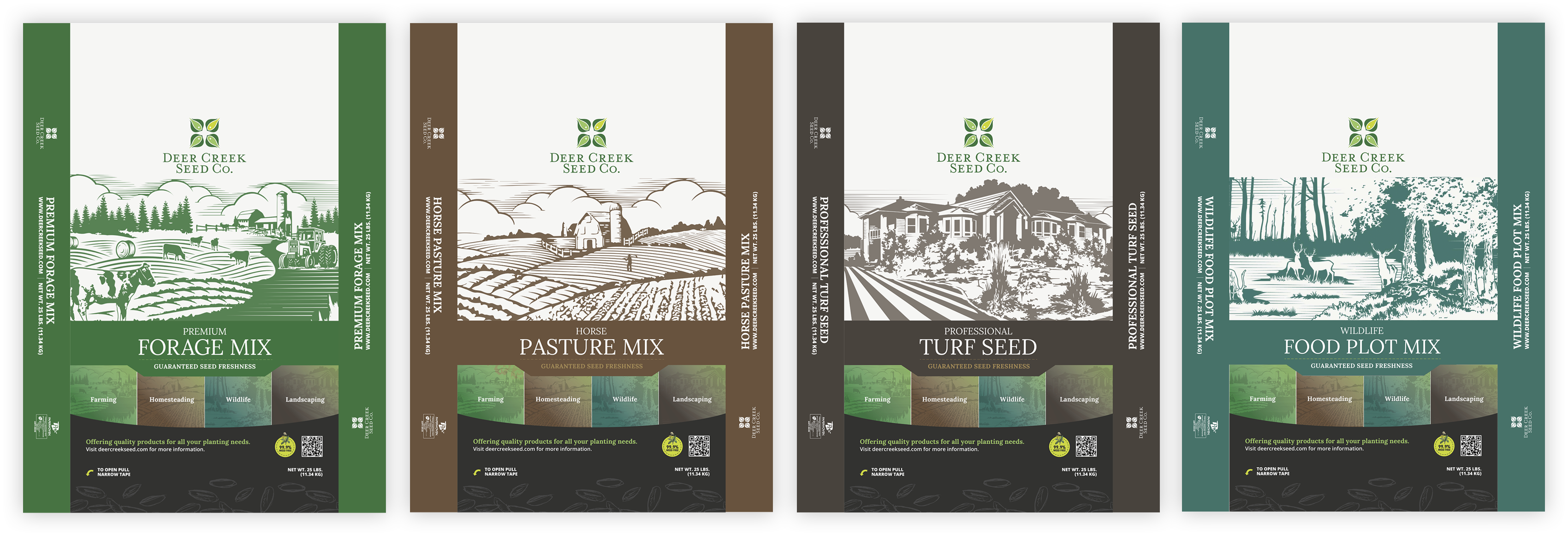
Consolidate all brands for recognition and differentiate products by category.
- Consolidate existing sub-brands while reorganizing products by application type.
- Introduce a brand phase-out approach to educate customers during transition.
- Unique SKU per seed species, regardless of application type.

5. Results & Learnings
+27%
Online Purchase
Conversion Rate
+101%
YOY
Revenue Growth
Research had to move fast due to the lack of funding and time. The team outlined the main knowledge gaps and how to most efficiently fill them. Insights were collected from a mix of techniques ranging from reaching out to customer service to social listening and parsing existing forums.
Although unconventional research methods provided valuable insights, it could not completely replace direct user interviews and observations. Our effort provided puzzle pieces forcing us to complete the picture with client insights. There were multiple instances where suspected bias was introduced from secondary source information.
One could consider “ninja” research on such resource-dry projects. However only so much personal time can be invested before creating a net loss.
6. Reference Material
For a deep dive into the project, please reference the following links:
