1. Context & Problem
- Juice Generation produces and sells healthy juice blends, cleanses and detox formulas for health-oriented customers.
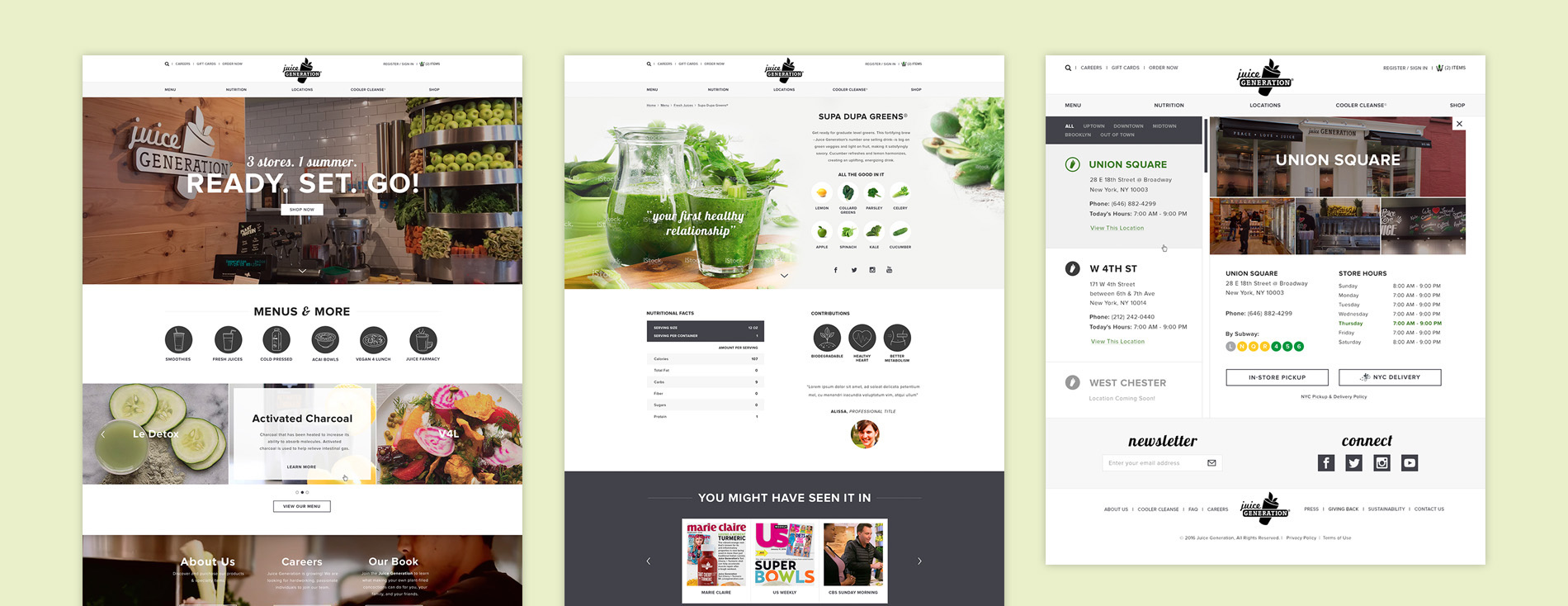
- Two brands needed to be consolidated with a consistent design language.
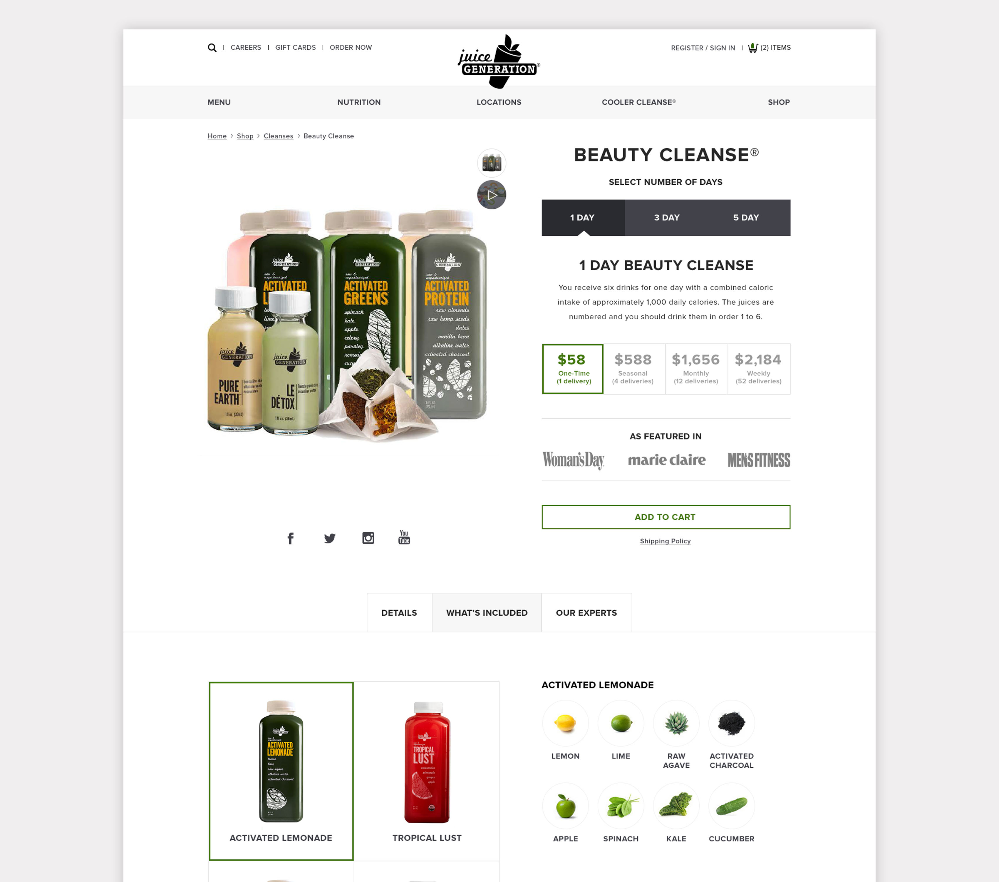
- As opposed to conventional ecommerce websites, shoppers can only purchase subscriptions and/or mix-and-match six bottle packs.
2. What We Did
- Interviewed 10 frequent customers.
- Competitive research.
- Website redesign.
3. Key Findings
- Subscription options in the website are unclear, multiple users dropped off after not being able to understand how many bottles they would receive and how often.
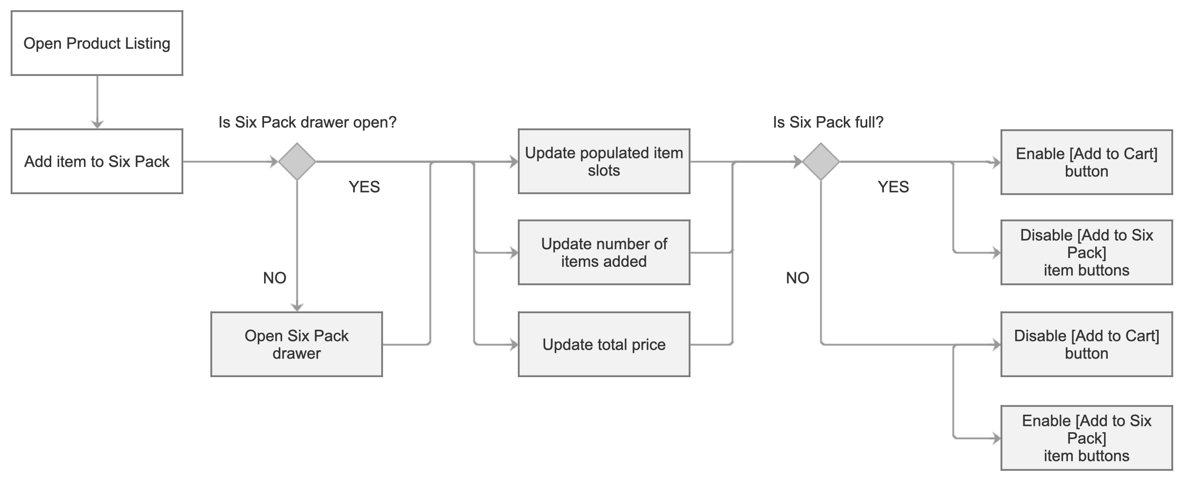
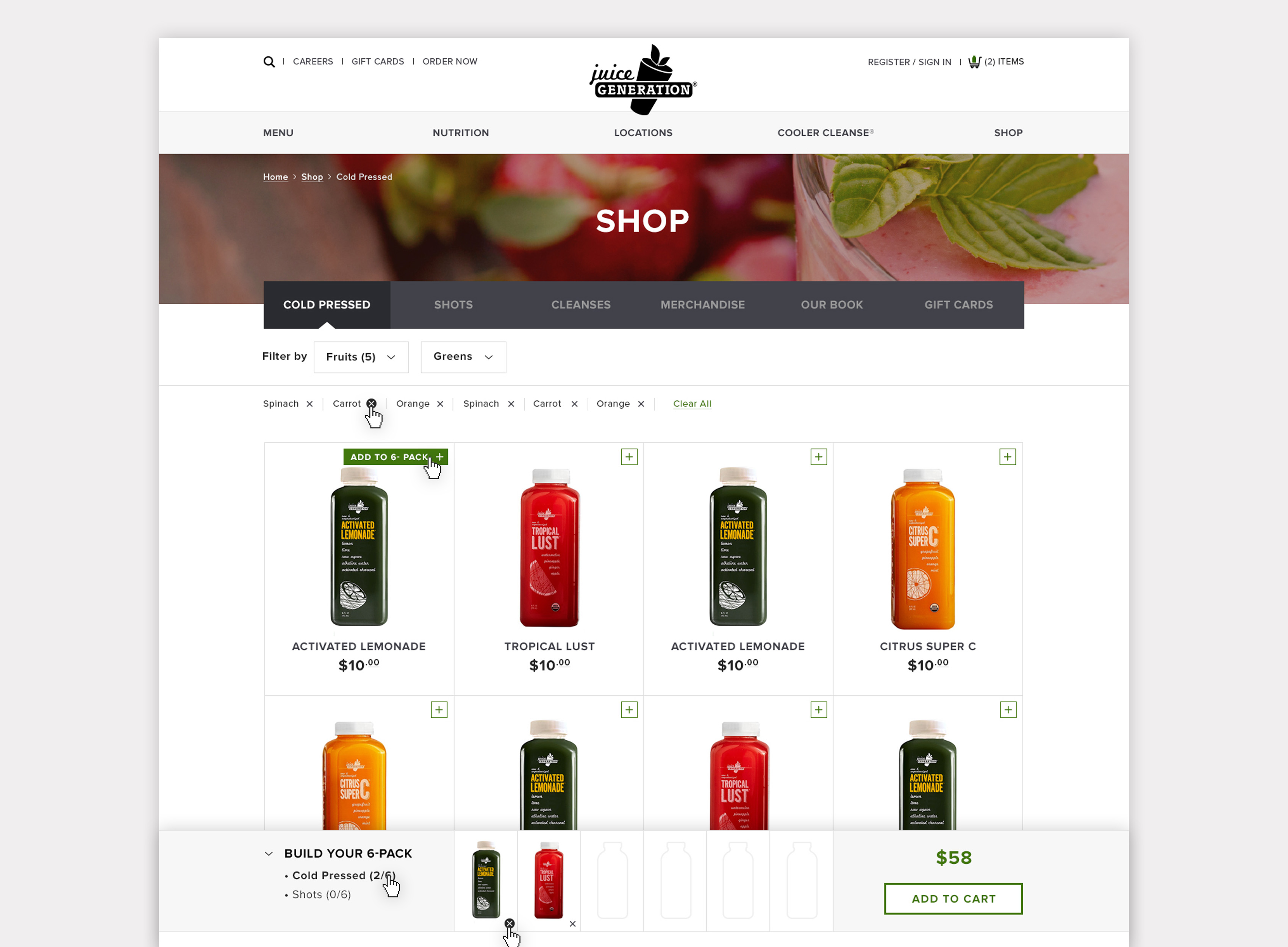
- Hard to track what was added or not in a six pack, forcing customers having to either write down or recheck for reference.
- Nutritional value is a major concern since cleansing involves full long term commitment with no other food types in the diet.
- Much of the brand is perceived as unwelcoming, text is small, hard to read and important information such as ingredients and nutrition are either hidden or missing.
- New customers mainly discover the brand through gossip magazines and celebrity endorsements.
4. Recommendations
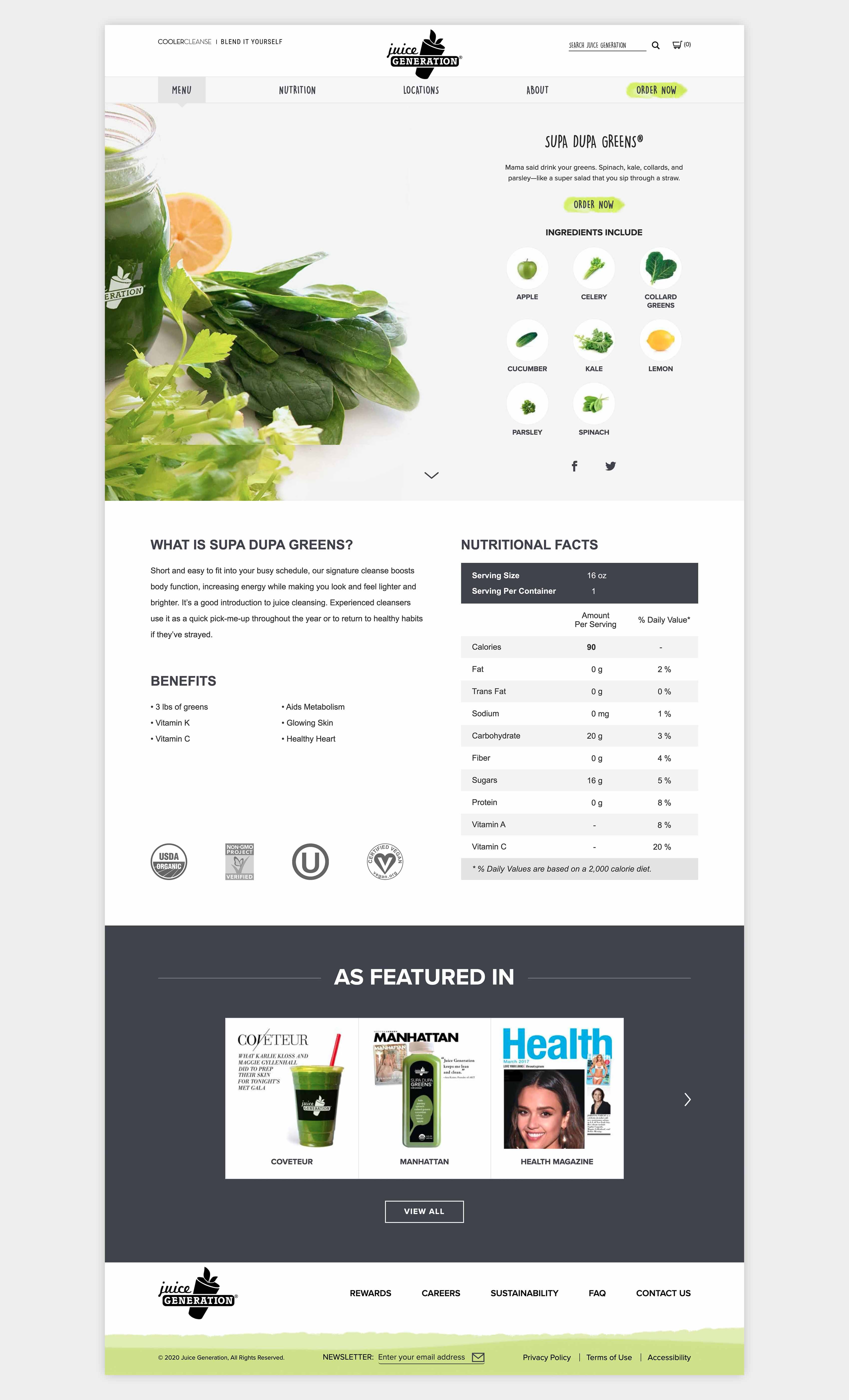
Display consistent information across subscription options for users to compare and contrast.
- Introduce descriptive names for users to infer what is included in the option.
- Inform customers exactly what they will receive.
- Organize options logically by increasing price and delivery frequency.
Introduce a visual six pack building tool to relieve user’s short term memory load.
- Avoid instances of users forgetting what was added or removed.
- Visual feedback reassures users chosen products are saved.
Display accessible and transparent product information across the website.
- Clearly display ingredients and nutritional information rather than hiding in small text.
- Highlight key certifications important to customers.
- Introduce value content such as publications that may interest the target customer.
5. Challenges & Learnings
The biggest learning was experiencing how much an involved stakeholder can move a project’s speed. It allowed us to play through multiple sketches and ideas. Furthermore, the lack of research allotted prompted the team to reach out to customers by visiting stores throughout the city. This research allowed us to focus on certain key aspects of the design instead of implementing every idea.
6. Reference Material
For a deep dive into the project, please reference the following links: