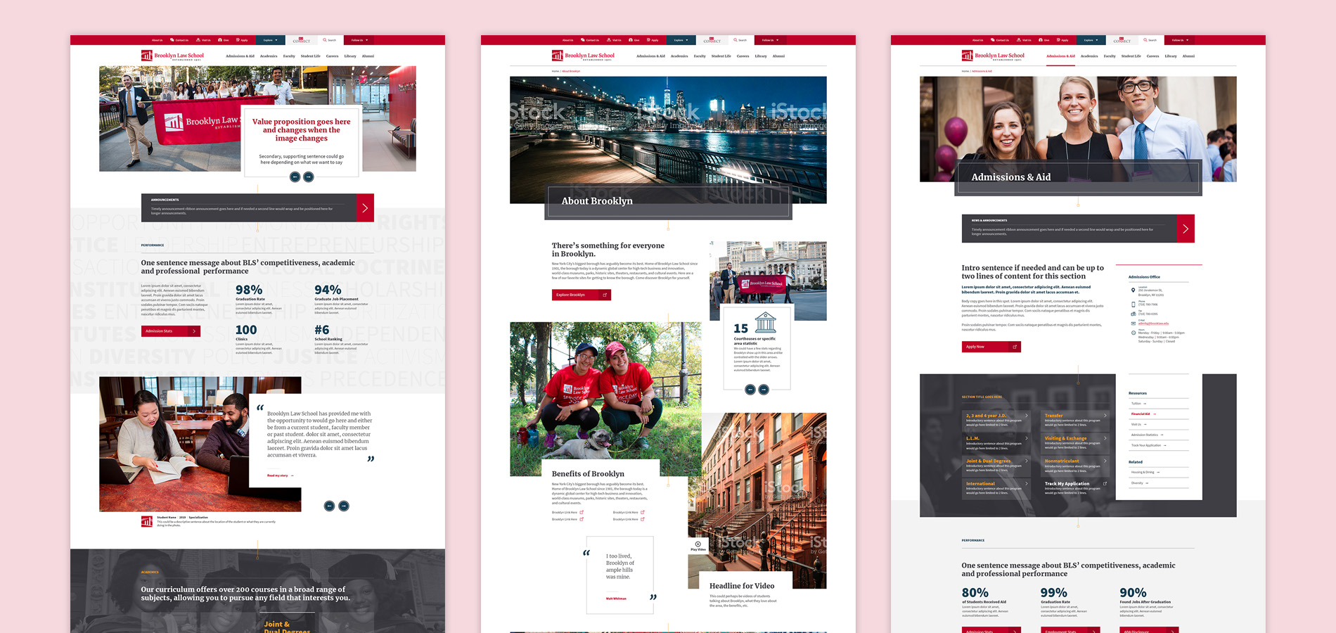
1. Context & Problem
- Brooklyn Law School offers law degrees and multiple real-life experience programs for jump start careers.
- The website has grown organically since the last redesign.
- Lack of management and coordination created problems such as repetitive, out of date content and multiple instances of the same data needed to be updated independently.
2. What We Did
- User interviews
- Content inventory
- Website redesign
3. Target Audience
Findings were split into 10 target audiences based on unique behaviors.
- Prospective students (Pre-application, uncommited)
- Applicant (Undergraduate)
- Applicant (Continued Education)
- Admitted Students
- Alumni and Donors
- Journalist / Law Bloggers
- Faculty
- Current Students
- Prospective Student Parents
- Staff / Administration

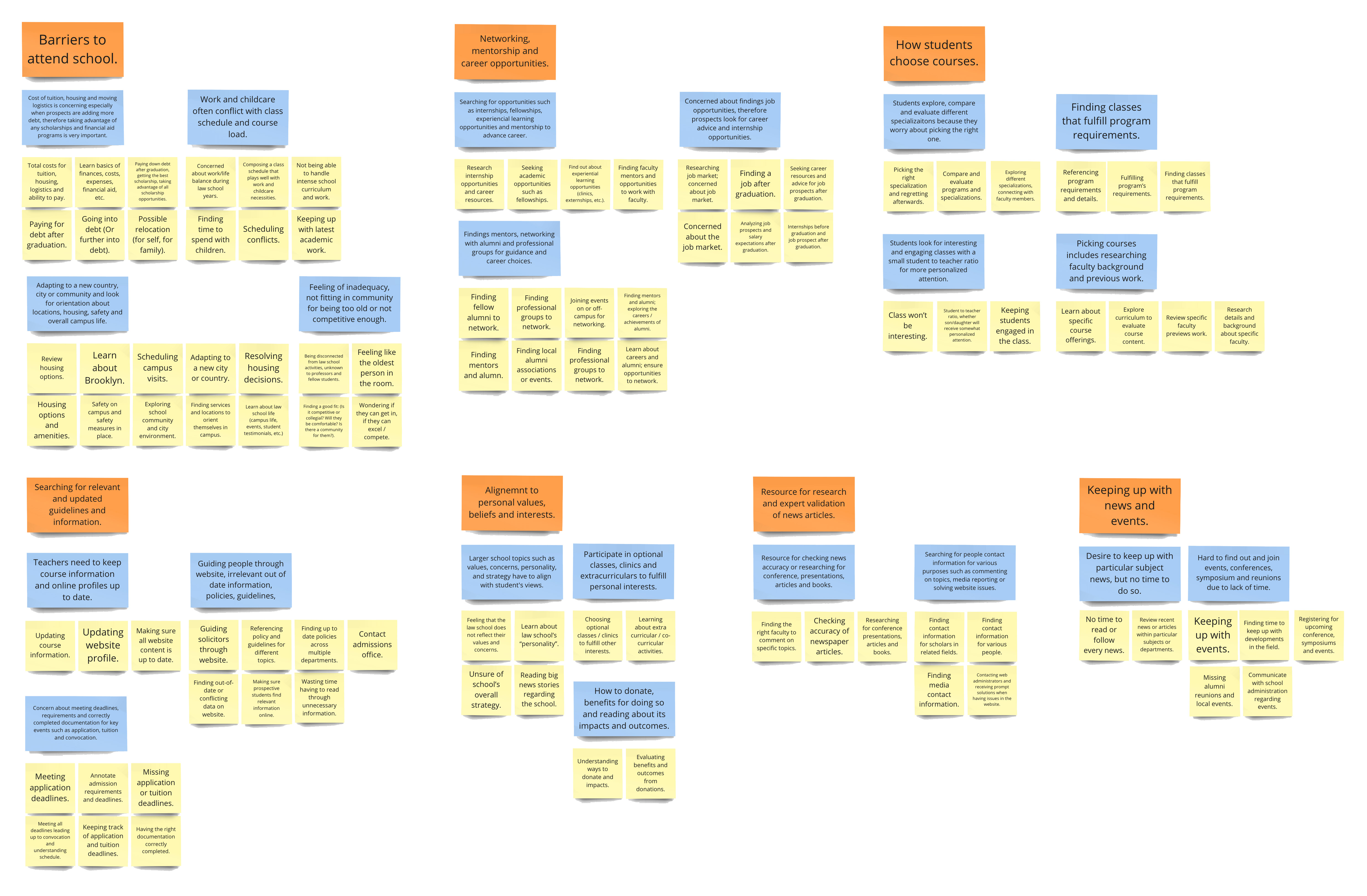
To manage the sheer amount of insights, the team further consolidated them into key points to reference and respect throughout the project.
- Barriers to attend school.
- Networking, mentorship and career opportunities.
- How students choose courses.
- Searching for relevant and updated guidelines and information.
- Alignment to personal values, beliefs and interests.
- Resource for research and expert validation of news articles.
- Keeping up with news and events.
4. Content Inventory
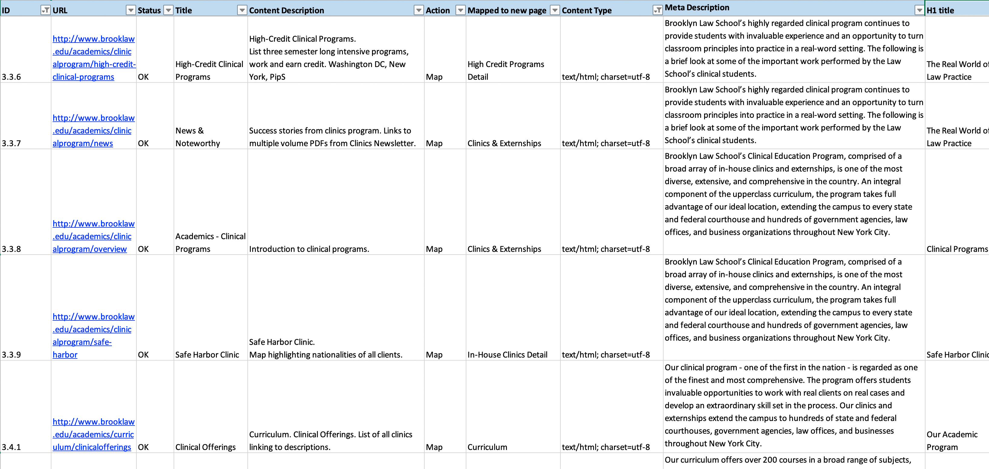
Due to the size of the website (over 15,000 urls), and the repetitive nature of the content, a content inventory was performed with the help of a crawler to make sure all content was present in the redesign.
5. Key Findings
- Many prospects are attending school at a later stage in life, where debt, childcare and career prospects are top of mind.
- Networking, mentorship, internship, experiential learning opportunities are actively seeked for to increase career prospects.
- There is a shared feeling of inadequacy, not fitting in and self-doubt when attending school as an adult.
- Courses are extensively researched by students when being picked. Choices are driven by how the professor’s background and past work align with the student’s values and interests.
- Redundant, repetitive and contradicting content was found throughout the website as a result from years of organic growth , requiring users to call for assistance and confirm accuracy.
- Inconsistent components used throughout, sometimes feeling like different sites under the same domain.
6. Recommendations
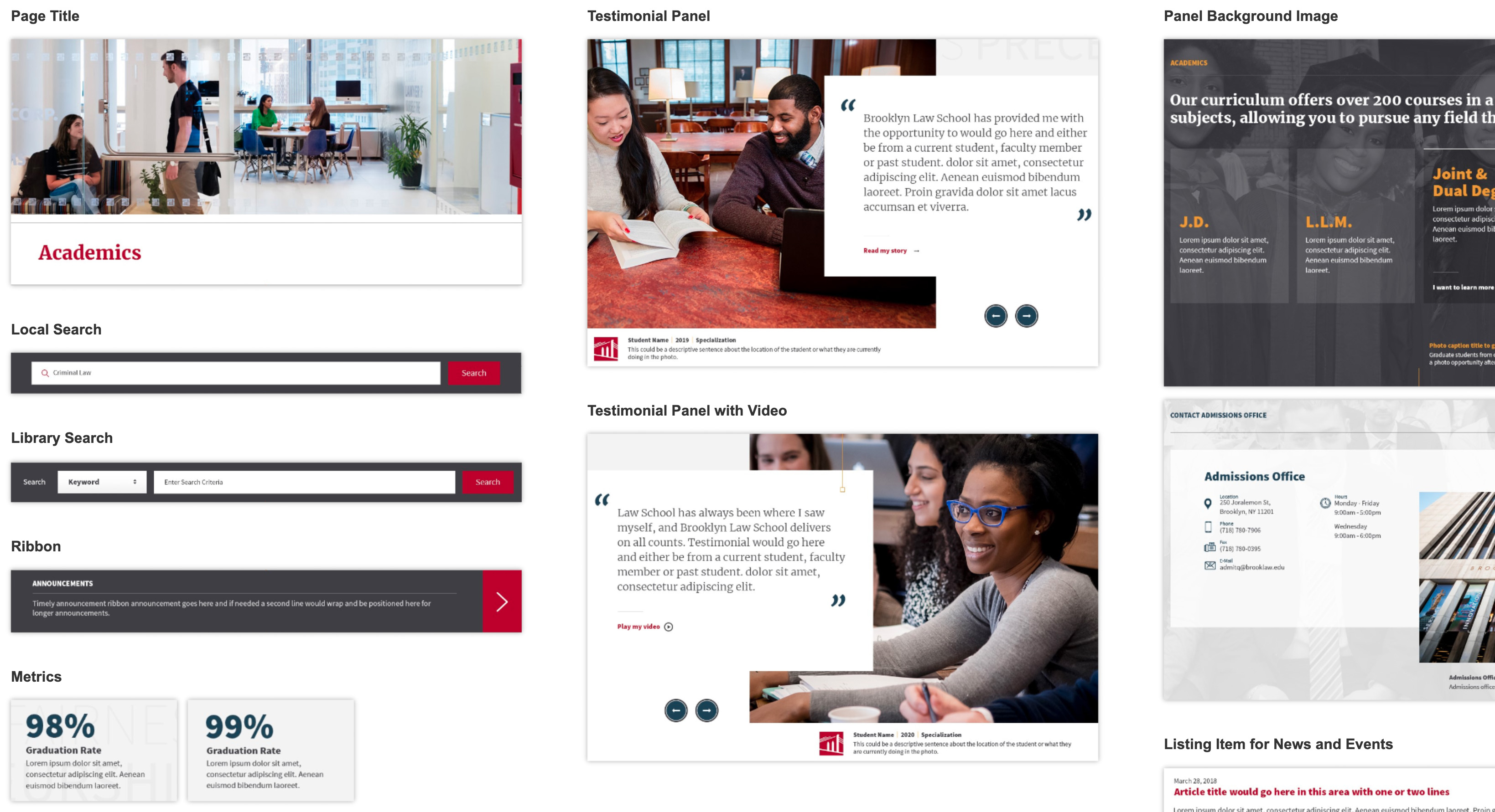
Standardize UI components across the website and introduce a design system.
- Components can be reused across pages.
- Consistent branding and feel.
- Possible future introduction of voice and tone standardization.
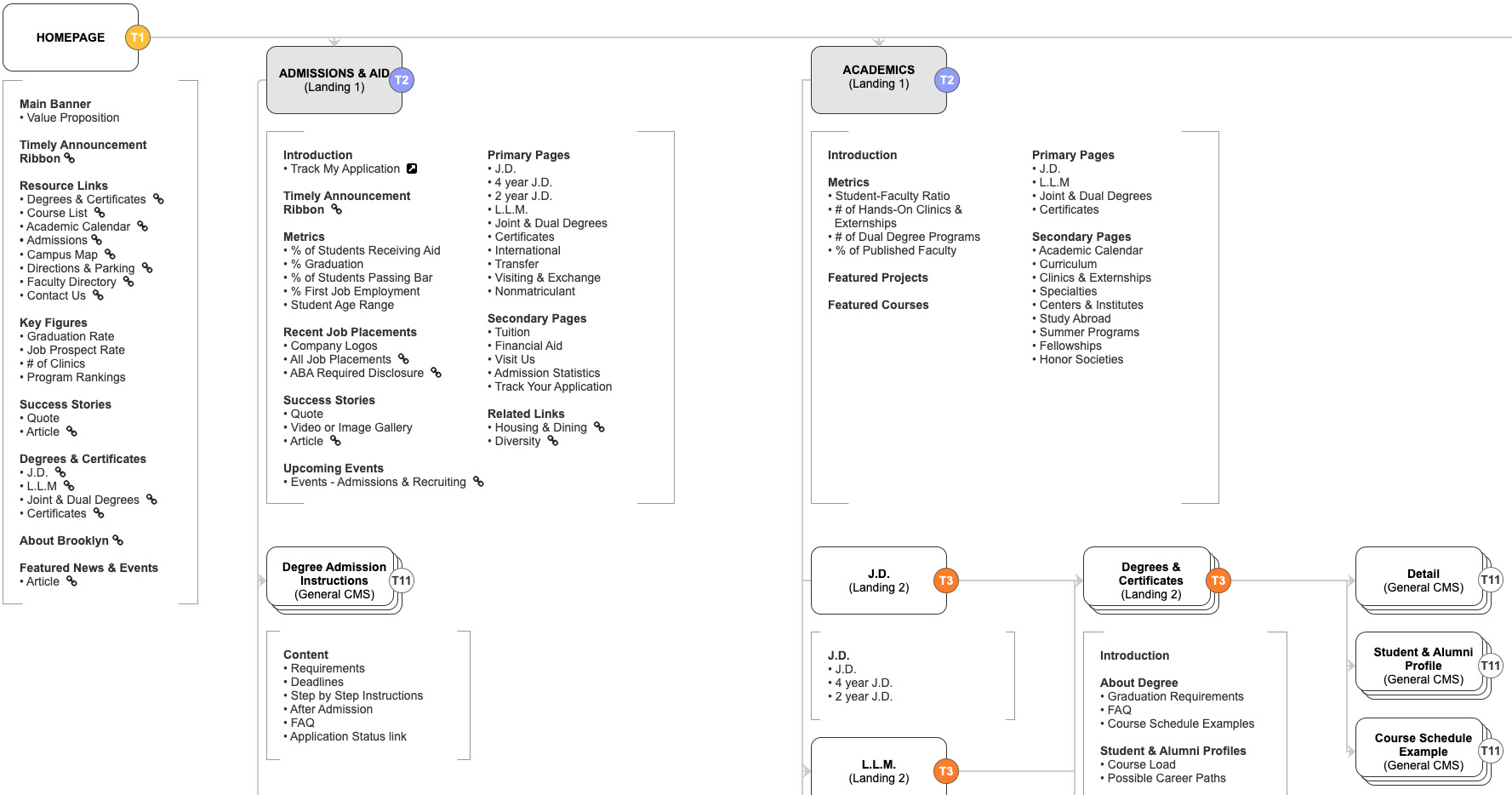
Map out content in the sitemap to ensure non-repetitiveness.
- Crosscheck each row from the content audit for a successful content migration.
- Detailed sitemap with content layout showing purpose of each page.
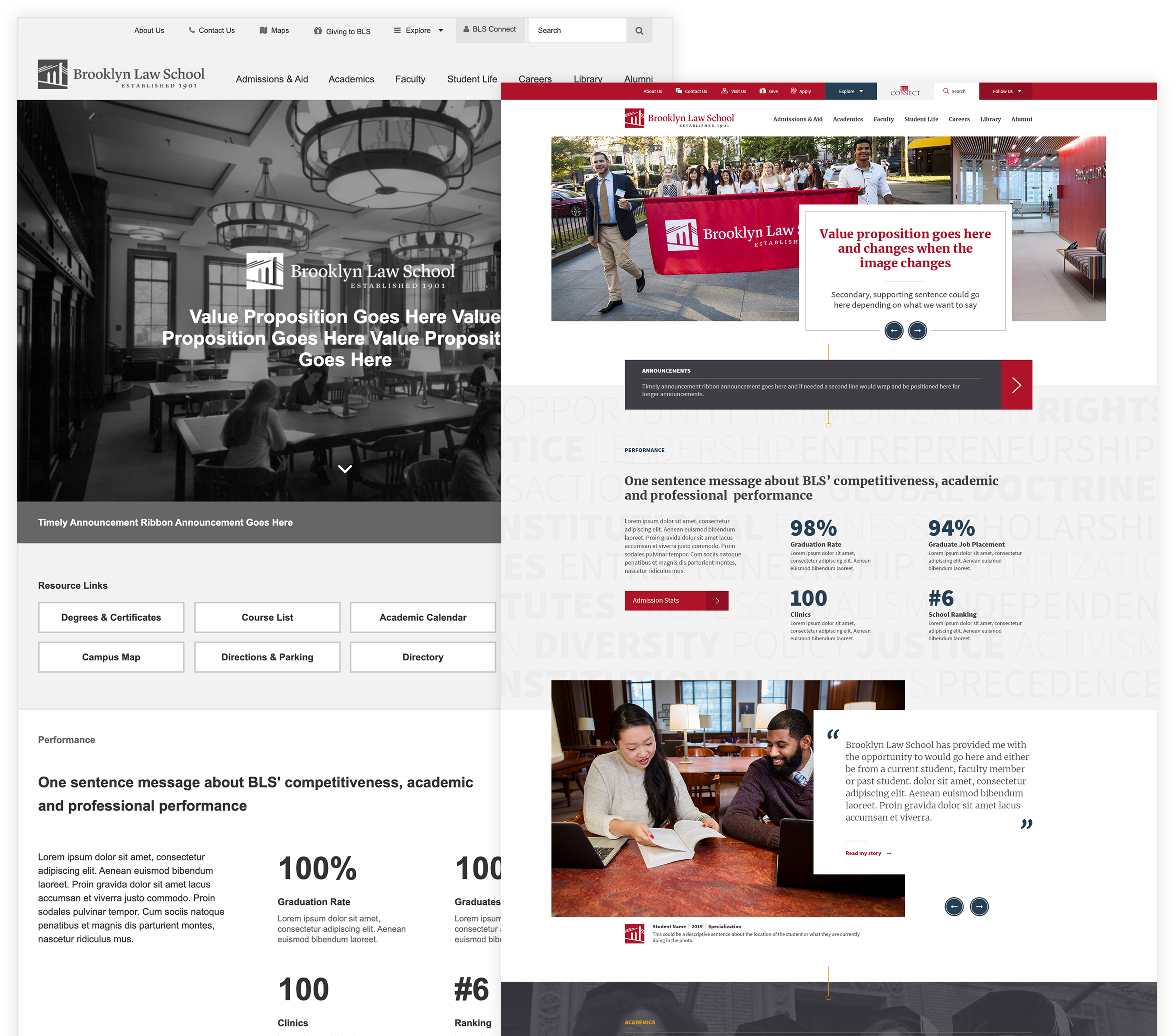
Validate BLS’ school experience and strong career prospects where it matters in the conversion funnel while linking to detailed reports.
- Graduation rates and job placement rate.
- Student aid rates and program ranking.
- Testimonials as told by students.
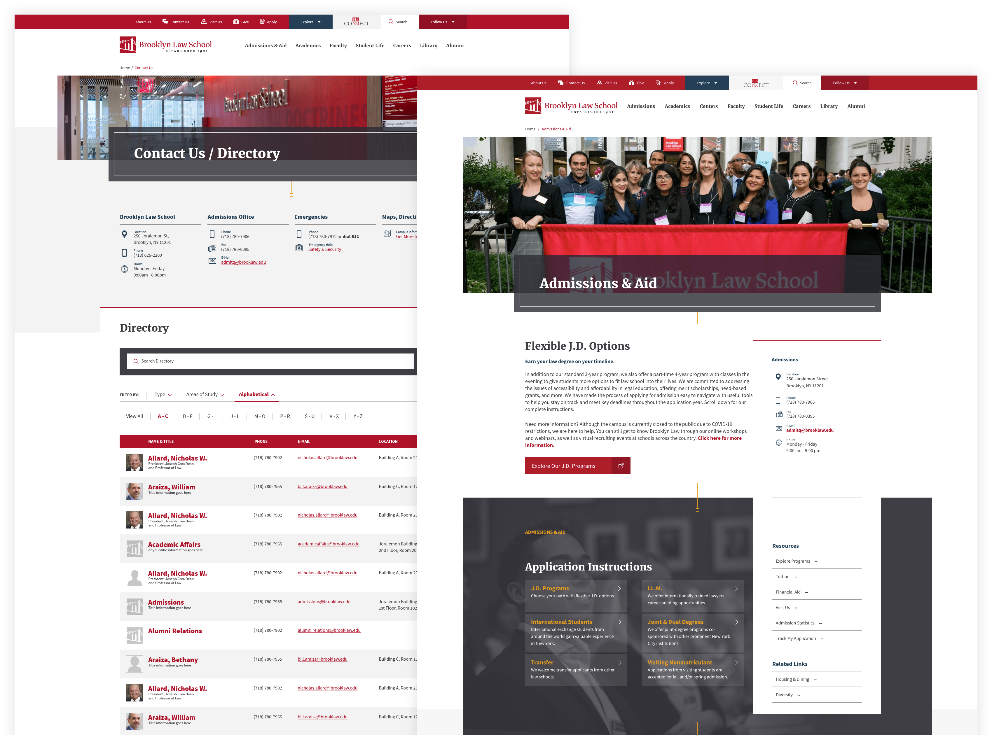
Surface key content users look for in consistent components and page areas.
- Each department, professor and office carries contact information.
- Standard placement of contact information.
- Prominent primary and secondary subpage link components.
7. Challenges & Learnings
During the discovery phase, we faced many internal stakeholders wanting their opinions to be heard and be accounted for. Making sure everyone's concern was considered, we managed to perform interviews, compile and perform affinity analysis of internal findings. Although initially seemingly contradicting, we found them to share common interests. These findings were later compared to the user-side findings for validation and most importantly, allowed all internal stakeholders to be heard and considered.
Time limit affected the project outcome in terms of communication and implementation. Due to the large and diverse user base, and size of the website, we chose to use most of our time in the discovery while leaving less for wireframes and documentation. These limitations proved to be a problem later on, especially because implementation was outside our control. Pages were developed without the initial planning intention and in some instances content repetition and irrelevant components were used, recreating some of the issues we were trying to avoid.
In retrospect, documentation could have been clearer in two key aspects: Mapping of content Mapping of components. Although each row of the content inventory was mapped to the sitemap, no specific person managed the merging and production of content. This resulted in instances we were trying to avoid, such as repetition and redundancy. As for the components, instead of fulfilling contractual agreement of wireframes, we could have opted for puzzle-like diagrams of every page labeled and mapped to design system components.
8. Reference Material
For a deep dive into the project, please reference the following links:
